tado° Energy planner
Interactive planning tool for energy savings potential
This project was developed as a Master's thesis in cooperation with tado° GmbH, a German smart technology company based in Munich and a leader in intelligent climate solutions across Europe.
Company
tado GmbH
Task
UX research UX design UI design
Industry
Home energy management
Year
2024
Permission to publish this project on my portfolio was officially granted by the company, tado GmbH
The company had planned to launch a new product line called LineX. This planning tool on the website presented a valuable opportunity to integrate the study of business growth, brand building, and customer satisfaction. Therefore, the project aimed to explore and develop interactive solutions to optimize the user experience in planning energy savings potential and to support the buying process, with a focus on human-centered design.
Challenge
As the main accessible medium for communication, the website currently provides extensive information regarding product knowledge, installation guidelines, online shopping tools, customer support, and more. However, most of the existing information is presented as static content, resulting in one-way communication. Since passive content primarily requires reading and offers minimal interaction, customers are likely to spend significant time consuming the abundant information. Moreover, customers do not have any options to plan or simulate energy savings for their homes before making a purchase. Therefore, an interactive component on the website could become a valuable addition to the ecosystem, enhancing the user experience during the shopping process and increasing customer engagement with the brand and its products.
Methodology
In the process of developing the thesis, they separated into three different phases; user research, design development and usability testing & evaluation.
User research
The user experience research aims to study and define the target users, including their needs and requirements across different contexts. It consists of four main parts, as outlined below.
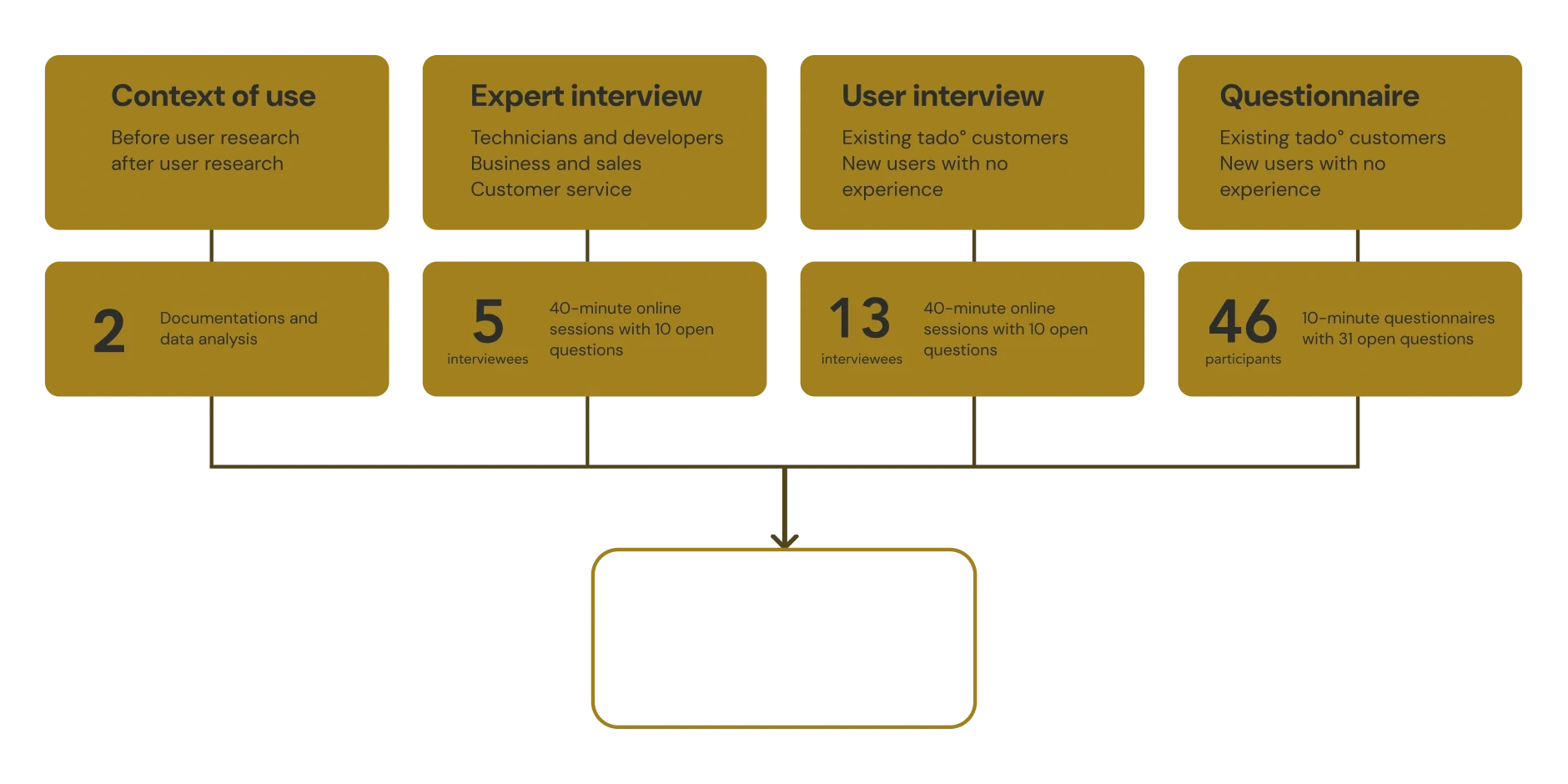
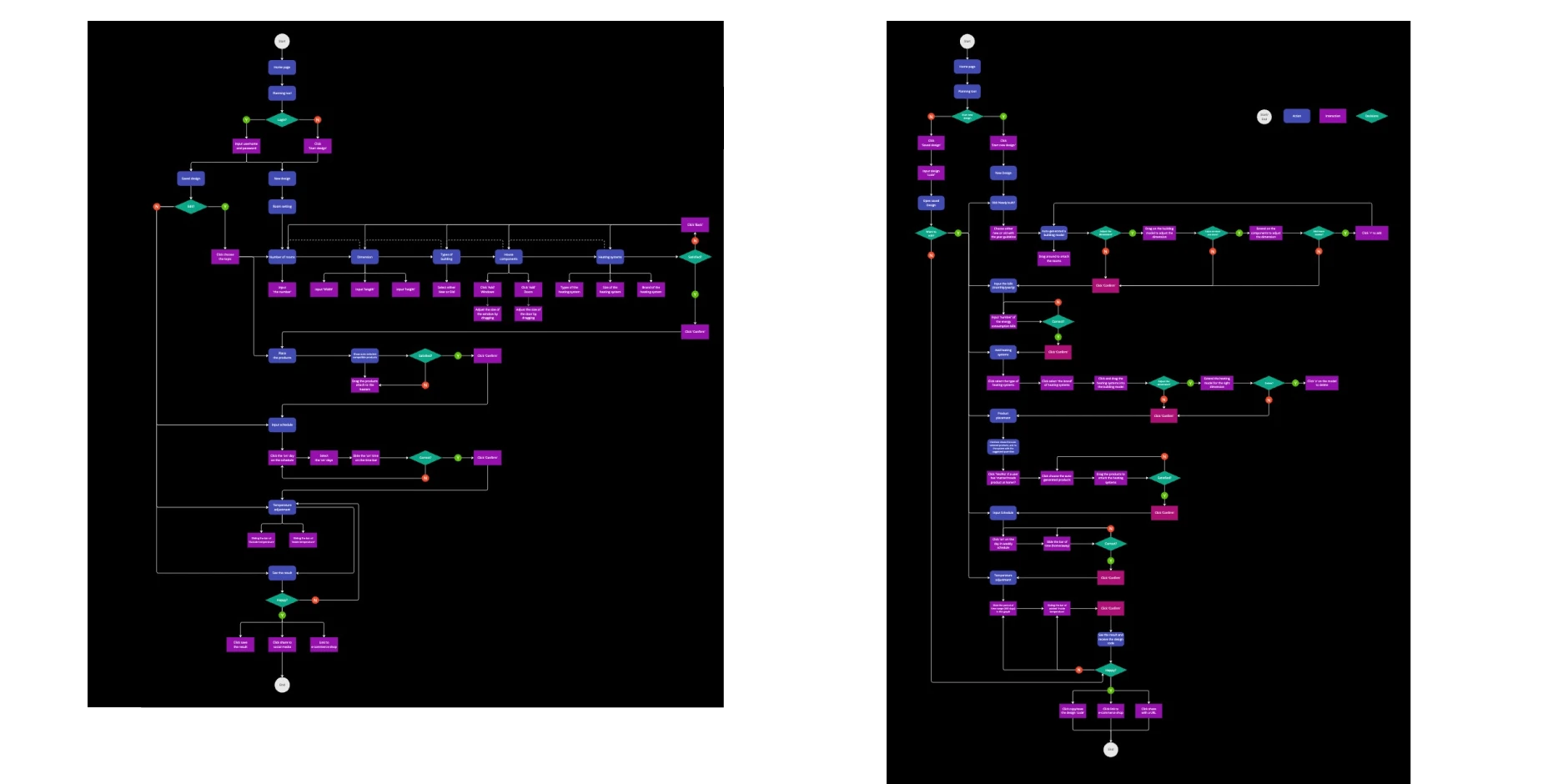
User flow analysis
After identifying the key functions, the user flow was mapped out using flowcharts to ensure the user journey aligns with expectations. These flows were then used as the foundation for wireframes and prototype design. Two versions of the user flow were created: a draft version and a final version. The final version was refined to enhance flexibility, support more complex decision-making processes, and integrate automatic generative functions. These improvements help users save time during the planning phase while allowing for customization based on their personal data and preferences.
Design
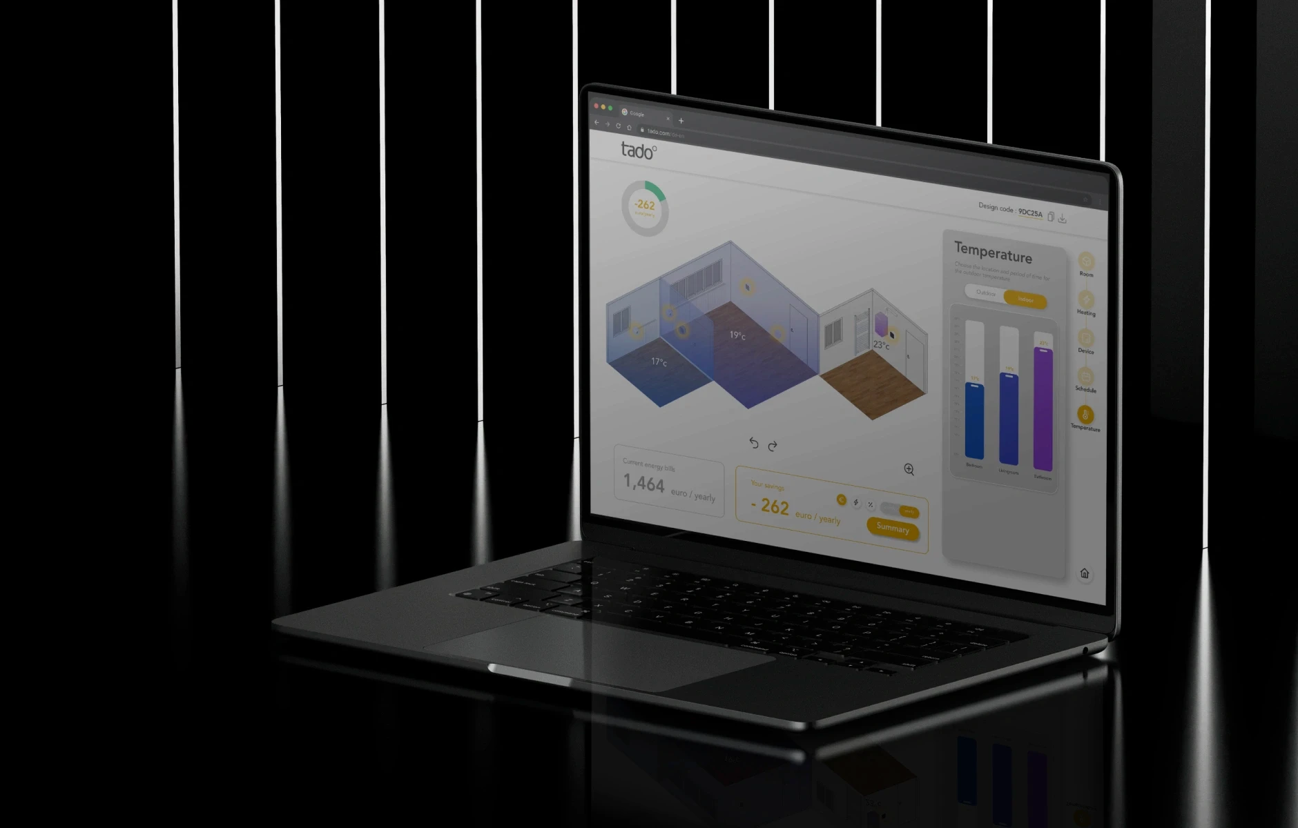
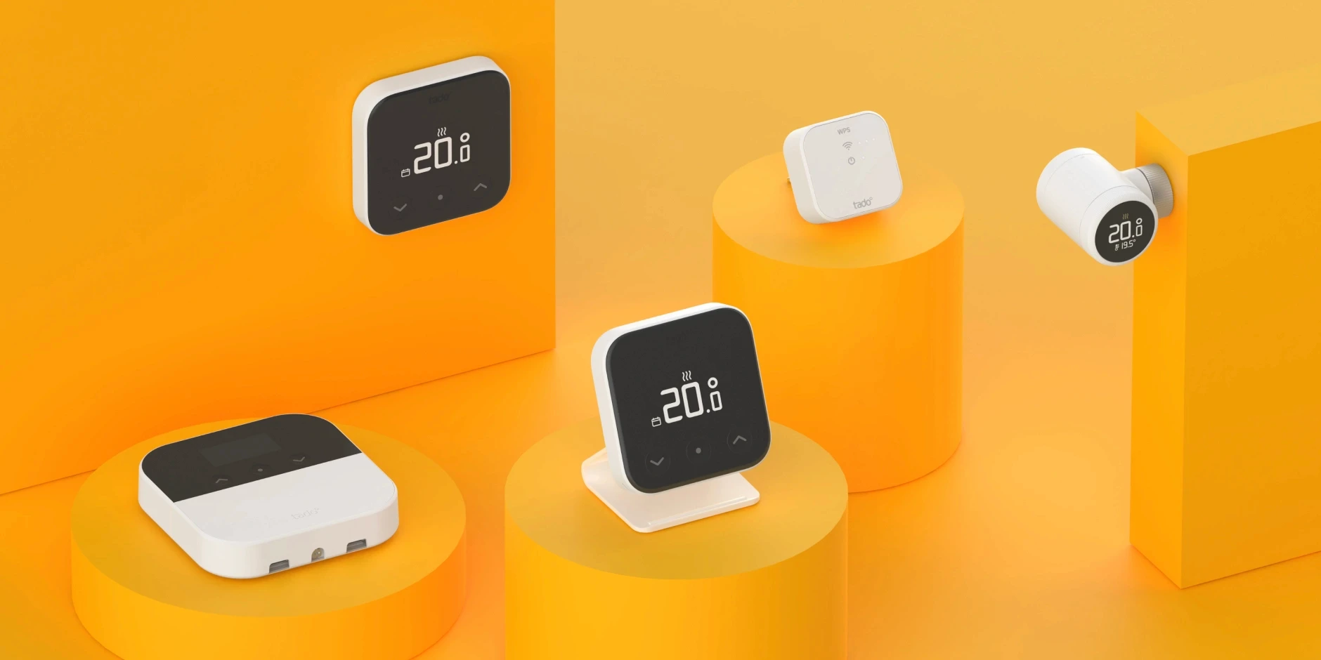
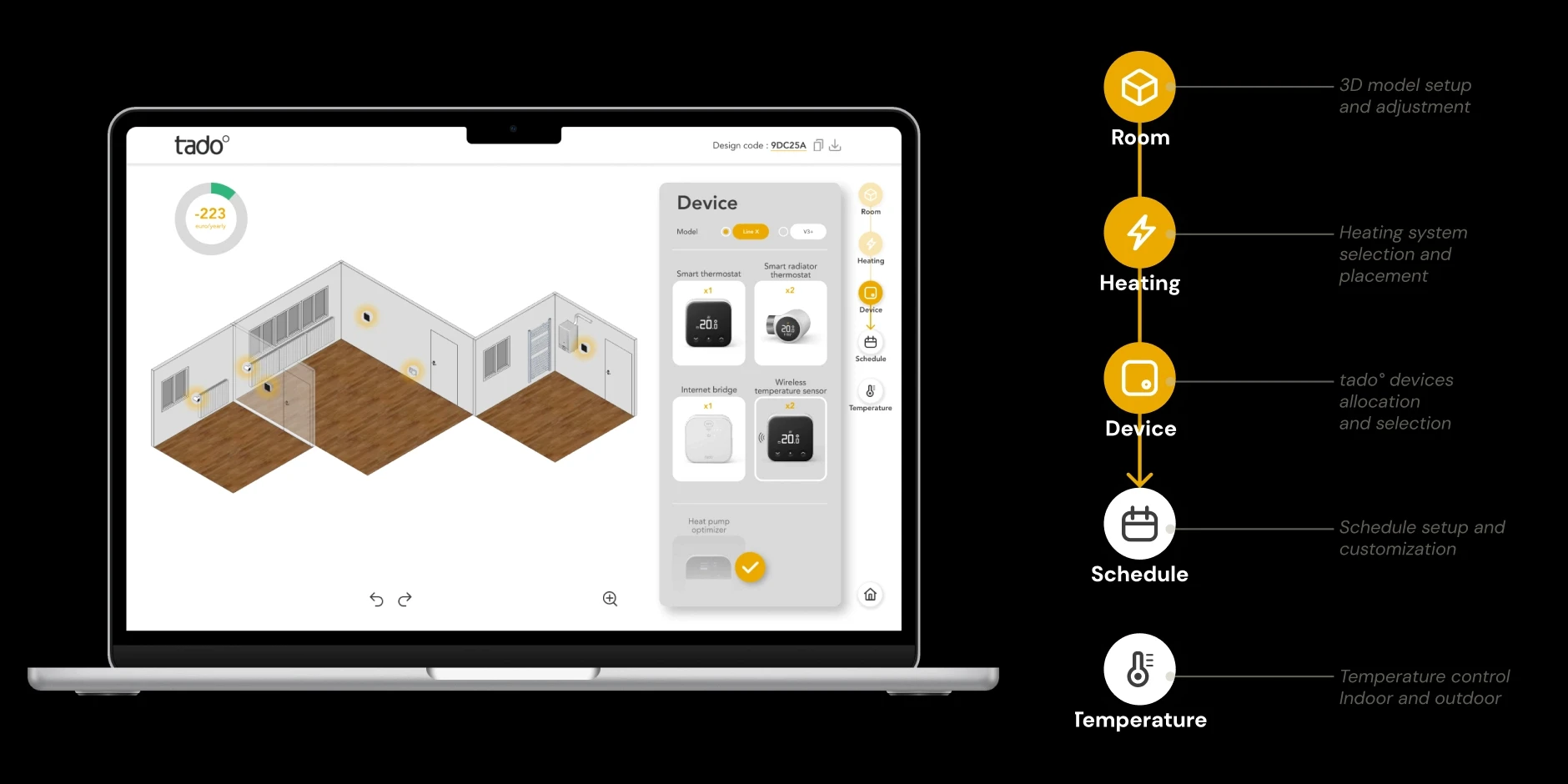
Based on the user research and analysis, the main planning process in this tool was defined with five core functions and an introductory section, as outlined below. Step 0 - Information input Users are required to input data related to energy consumption, types of heating systems, insulation quality, energy bills, and the number of rooms they wish to include in the planning process. Step 1 - Room, 3D model setup and adjustment Analysis of the two wireframes led to improvements that streamlined the 3D model-building process, especially for users without architectural design experience. The system now generates a default model based on room dimensions and quantities entered in the introductory interface. Step 2 - Heating, Heating system selection and placement Users place heating systems by dragging 3D models from the control panel into the layout. This step gathers key information for calculating energy savings and checking system compatibility.
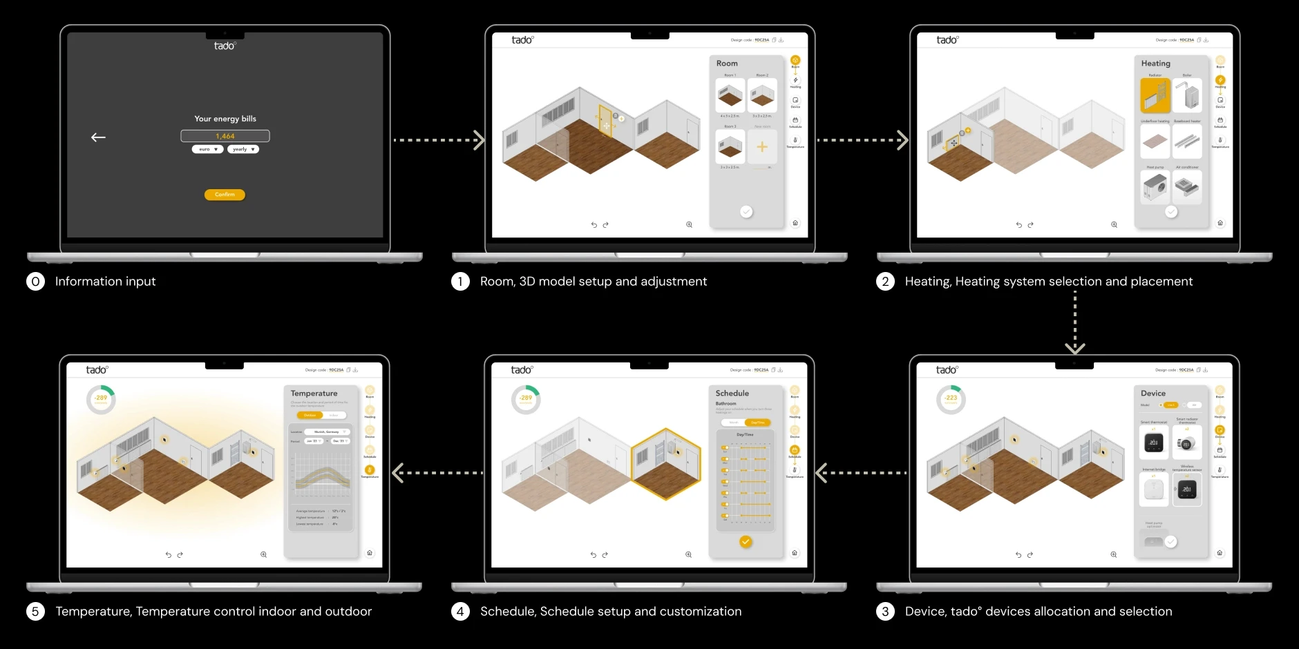
Step 3 - Device, tado° devices allocation and selection After users select their heating systems, the automated system pairs compatible devices for them, addressing the need for simplicity due to limited technical knowledge. Product details and installation info are shown to support user understanding. Step 4 - Schedule, Schedule setup and customization User research shows that users can customize heating schedules based on their energy consumption habits. The interface lets them plan for when they’re home or away, helping reduce energy use and enabling more accurate energy savings calculations. Step 5 - Temperature, Temperature control indoor and outdoor This step educates users on how temperature variations impact energy savings. Users can adjust indoor temperatures for individual rooms and see real-time updates on the 3D model and infographic. Historical outdoor temperature data for specific locations and time periods enhances calculation accuracy.
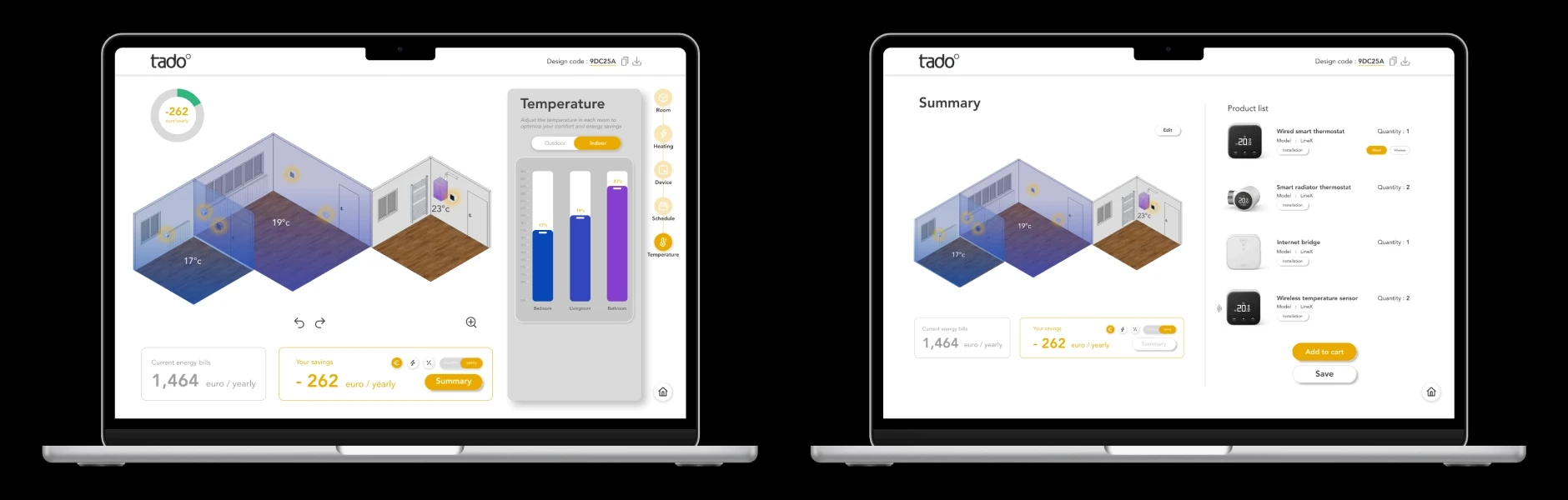
After the user confirms the plan, two boxes will appear below the 3D model. The left box, in a grey frame, shows the current energy bills based on the user's initial input, while the right box, in a yellow frame, displays the potential energy savings, shown by default in a currency unit. Meanwhile, the product list interface appears on the right side, showing the planned products for energy savings, including their types and quantities. Downloadable installation manuals are available beneath each product name.
Testing and evaluation
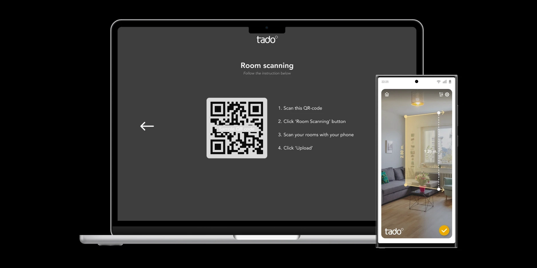
For product testing and evaluation, Jakob Nielsen’s 10 usability principles were used to assess the prototype, identify usability issues, and explore opportunities for improvement. This method helped uncover potential user errors and missing details that could enhance the overall user experience from a professional perspective. Additionally, a think-aloud test was conducted as a complementary usability testing method. Six target users participated in 30-minute online sessions, which included three parts: pre-test questions, prototype interaction, and post-test interviews, along with a satisfaction rating. User testing revealed four key improvement suggestions commonly shared by participants. One major recommendation was to add a feature that assists with 3D model building by allowing users to scan their rooms using smartphones. This feature would enable non-expert users to automatically upload room data, eliminating the need to manually adjust or build the 3D model within the interface.
As a result, regarding satisfaction with the time spent on planning, six participants rated it a 5—the highest level of satisfaction—while one participant rated it a 4. These results align with responses from the pre-test questions, where participants expected to spend between 10 to 15 minutes. The actual time spent during testing ranged from 9 to 13 minutes. Participants also expressed positive feedback about the tool itself. They found the interface user-friendly, simple, and intuitive. The participants specifically appreciated the visual design, noting that it helped them better understand complex information through effective visualization. Additionally, they valued the level of detail provided by the tool, including the ability to customize and adjust settings to suit their individual needs and living situations—for example, personalizing schedules and configuring devices individually.